How to Choose the Perfect Wedding Invitation Theme
Quick answer: To choose a wedding invitation theme, start with your venue and overall wedding style (rustic, modern, classic, beach, etc.), pick a color palette that matches your décor, then select a font and paper style that reflects your tone—formal, playful, or romantic. The invitation should feel like a preview of the wedding day itself, not a separate decision made in isolation.
Your wedding invitation is the very first thing your guests hold in their hands before the big day arrives. It sets expectations for everything that follows: how formal to dress, what kind of celebration to expect, and even the color palette they might see repeated in the décor. Yet with hundreds of styles, fonts, and color combinations available, picking the invitation theme can feel more overwhelming than choosing the venue itself. At The Wedding Invitations, we help couples work through this decision every day. Here's a complete, step-by-step framework for choosing a theme you'll love.
Why the Invitation Theme Matters More Than You Think
An invitation isn't just paper (or a digital file)—it's a design system that should echo throughout your entire wedding. The fonts, colors, and motifs on your invitation often reappear on menu cards, table numbers, welcome signs, and thank-you notes. Choosing the theme early gives your whole event a cohesive, intentional look rather than a collection of mismatched décor pieces chosen separately over many months.
A well-chosen theme also does something practical: it manages guest expectations. A guest who receives a formal, foil-stamped invitation dresses differently than one who receives a casual, hand-lettered beach-themed card. Getting this right avoids awkward wardrobe mismatches on the day itself.
Step 1: Start With Your Venue and Overall Wedding Style
Your venue almost always dictates the natural theme direction. A barn or vineyard points toward rustic or bohemian design elements—think kraft paper, twine, and script fonts. A ballroom or historic estate leans toward classic or luxury themes with foil accents and formal serif typography. A beach or garden venue suggests light, airy palettes with botanical or watercolor illustrations.
Ask yourself: does the venue feel formal or relaxed? Indoor or outdoor? Modern or traditional? The answers narrow your theme options considerably before you've even looked at a single template.
Popular Wedding Invitation Themes to Consider
Classic and Elegant: Timeless serif fonts, ivory or white cardstock, and understated details like a subtle border or monogram. This theme rarely goes out of style and suits nearly any formal venue, from ballrooms to historic mansions.
Rustic and Barn-Inspired: Kraft paper, twine accents, hand-lettered script, and earthy tones like terracotta, sage, and cream. Rustic themes pair naturally with outdoor, barn, or vineyard weddings and tend to feel warm and personal.
Modern Minimalist: Clean sans-serif typography, generous white space, and a restrained color palette (often black, white, and one accent color). Minimalist invitations suit couples who want a sleek, contemporary aesthetic without excess ornamentation.
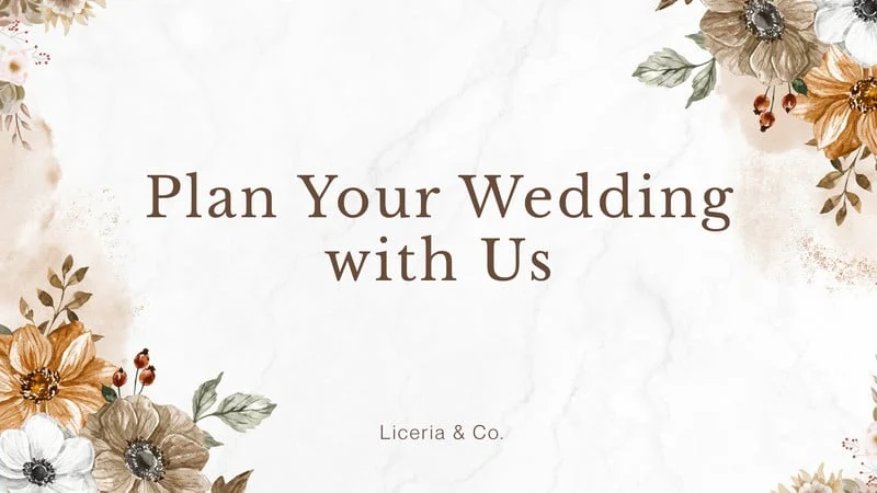
Bohemian and Wildflower: Loose watercolor florals, earthy terracotta and dusty rose tones, and organic, hand-drawn illustrations. Boho themes work beautifully for outdoor, garden, or desert weddings with a relaxed, artistic feel.
Vintage and Heirloom: Muted color palettes, ornate script fonts, and design cues borrowed from past decades—think Art Deco flourishes or 1970s botanical prints. Vintage themes suit couples drawn to nostalgia or a specific decade's aesthetic.
Floral and Garden Party: Bright, illustrated blooms paired with soft pastel or jewel-tone backgrounds. This theme is a natural fit for spring and summer weddings, garden venues, and greenhouse receptions.
Beach and Destination: Light color palettes—sandy neutrals, soft blues, coral accents—paired with airy typography and sometimes a watercolor coastline illustration. Ideal for destination weddings or ceremonies near water.
Cultural and Traditional: Many couples incorporate cultural motifs, colors, or bilingual text that reflect family heritage, from intricate mehndi-inspired patterns to traditional color symbolism specific to a culture or region. These invitations often carry deep personal meaning.
Whimsical and Fairytale: Soft illustrations, dreamy color washes, and playful typography for couples who want their invitation to feel like the opening page of a storybook. This theme pairs well with evening, castle, or garden-estate venues.
Luxury and Glam: Foil stamping, deep jewel tones (emerald, navy, burgundy), and thick, textured cardstock. This theme signals a formal, high-end celebration and pairs naturally with black-tie or ballroom weddings.
Step 2: Choose a Cohesive Color Palette
Once you have a general style in mind, pick your colors. A cohesive palette usually consists of three elements: a dominant color, a supporting neutral, and an accent tone. These colors will appear on the invitation card and can be repeated across envelope liners, wax seals, and ribbons.
Step 3: Pay Attention to Fonts and Hierarchy
Typography is a powerful way to express theme. Modern designs use clean, geometric sans-serif fonts; classic designs favor serif fonts and traditional script; romantic themes rely on organic hand-drawn lettering. Pair a bold font for your names with a simpler, highly readable font for date, time, and location details.
Frequently Asked Questions
How do I choose a wedding invitation theme that matches my venue? Start by considering whether your venue feels formal or casual, indoor or outdoor. Barns and vineyards suit rustic themes, ballrooms suit classic or luxury themes, and beaches suit light, coastal palettes.
What is the most popular wedding invitation theme right now? Modern minimalist and understated botanical themes remain especially popular in the United States, though classic elegant designs continue to be a timeless, widely chosen option.
How many colors should be in a wedding invitation theme? Most designers recommend two to four colors: one dominant shade, one neutral, and one accent color, to keep the design cohesive without feeling cluttered.
Should my invitation theme match my wedding decor exactly? It doesn't need to match exactly, but it should feel like part of the same visual story, sharing similar colors and a consistent level of formality throughout the event.
Can I choose a different theme for digital and printed invitations? It's best to keep the same theme across both formats for consistency, though layout can be adjusted slightly to suit each format's strengths, such as adding animation to a digital-only version.
Is it okay to change my invitation theme after ordering save-the-dates? It's possible, but it can create a mismatched stationery suite. It's best to finalize the theme before ordering any piece of wedding stationery, starting with save-the-dates.
Final Thoughts
Your wedding invitation sets the tone for your whole celebration. By aligning your style, palette, and fonts with your venue and overall wedding vision, you create a cohesive design system that will welcome guests beautifully and guide them smoothly through your celebration.